The day we discovered our website was lying to us
On 7 April 2026 we merged a continuous integration fix to ImpactMojo, a correction to how our accessibility workflows read their own results. We expected nothing visible to happen. Instead, the fix uncovered 393 accessibility violations on the 13 pages our pa11y-ci scanner tests, hidden in plain sight since the audits were set up.
Every pull request before that fix, including the nine merged in the session before it, had been silently passing accessibility checks. Every dashboard said "all green." Every commit said "tests passing." But the underlying tools (axe-core and pa11y-ci, the two industry-standard accessibility scanners) were producing failure reports that the workflow was misreading as successes. The bug was an exit-code check: $? after a piped command captures the exit code of the last command in the pipe (in our case, tee, which always returns zero), not the upstream command we cared about. The fix was ${PIPESTATUS[0]}.
A change of a few characters exposed hundreds of hidden errors. This is the story of what we found, what we fixed, and what we learned about the gap between "technically accessible" and "actually accessible."
What WCAG 2.1 AA actually means
The Web Content Accessibility Guidelines (WCAG) 2.1 Level AA are the W3C standard for web accessibility. Level AA is the target we hold ourselves to. It is the floor: the minimum that lets people with low vision, dyslexia, motor impairments, screen readers, and many other conditions actually use a website. It is also what most government partnerships, UN agencies, and educational institutions require their digital partners to meet. Our own accessibility statement commits to it.
The rules are concrete. Text must have a contrast ratio of at least 4.5:1 against its background, or 3:1 for large text (Success Criterion 1.4.3). Every form field needs a label. Every interactive element needs a name that screen readers can announce. Colour must not be the only thing that sets a link apart from the text around it (1.4.1). Heading levels should not skip, and a link to an #anchor should land on an element that exists. Scanners flag both, although they are best practice more than strict pass-or-fail criteria.
None of this is glamorous. The World Health Organization estimates that 1.3 billion people, 16 percent of the world's population, live with a significant disability. Not every one of them meets barriers on the web, and for those who do, these rules decide whether a website includes them.
From 393 errors to zero, pass by pass
After we fixed the workflow bug and could finally see the truth, we started working through the errors. Here is what the trajectory looked like, pass by pass, in one working session:
- Pass 1 (393 → 77 errors): One colour change on the dataverse page's "Visit" button, plus colour-token bumps on three other pages. The button was sky-500 with white text, a contrast ratio of 2.77:1, well below the 4.5:1 floor. There were roughly 260 cards on the page, so that single change cleared 271 errors in one shot.
- Pass 2 (77 → 21): Form fields without labels, buttons and JavaScript-injected modal search inputs without accessible names, and a handful of contrast fixes.
- Pass 3 (21 → 14): The theme switcher's default was inverted. In a headless browser such as the one our test runner uses, no colour scheme is set, so the script's test for the
lightscheme failed, and the page fell back to dark mode, so every audit ran against dark-theme tokens. We inverted the check on forty-one pages. That left gradient buttons, which pa11y reads asbackground-color: transparentand scores as white text on white. In pass 4 we added an explicitbackground-colorfallback to twenty-seven gradient rules across three pages. - Pass 4 (14 → 1): Two CSS faults. In four files a selector list grouped
[data-theme="light"]with body.dark-mode, so the light theme received dark-theme token values. Separating them removed most of what was left, and the gradient fallbacks had to be declared after the gradient shorthand to take effect. - Pass 5 (1 → 0): A single text colour on a contact button. Done.
Five passes, roughly four hours of focused work, took the count from 393 errors to zero on all thirteen pages our scanner tests.

The five lessons that travel
1. Your CI is probably lying to you about something
The deepest bug was in the checking itself: for weeks we had been adding features and shipping pull requests while believing our accessibility tests were passing. The workflow was structured in a way that was easy to miss in code review (a piped command, an exit code check, a wrapper script that posted "All pages passed" if it took the wrong branch). Telling a team to be more careful would not have caught this. Assuming that a green check might be lying, and testing the failure path, would. The workflow now reads the audit's own exit code, and a separate step fails the job when that code is non-zero. We now have a test that intentionally introduces a violation and confirms CI catches it.
2. Most accessibility bugs are caused by a small number of root causes
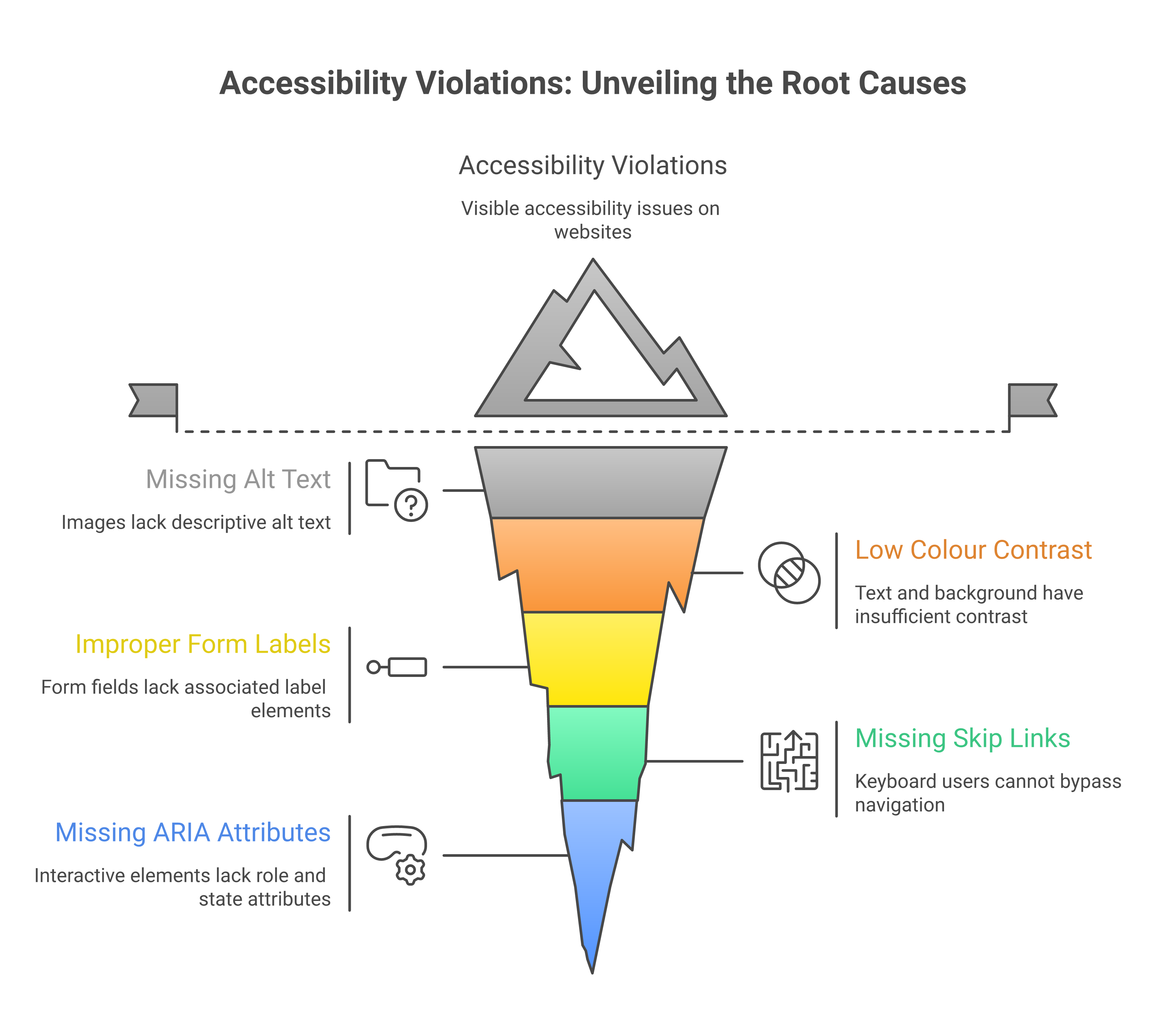
When you see "393 violations," it sounds like a project. But 271 of those came from one colour on one button class, repeated across roughly 260 cards on a single page. Most of the rest traced to a handful of shared causes: brand colours used as text, unlabelled form fields, an inverted theme default and a selector bug. The work was to find those five patterns, and the 393 followed from them.
Automated scans earn their place by clustering errors so that the patterns show, even though they miss plenty (see below).
3. Brand colours and accessibility are in tension, and it takes design work to resolve it
Our brand uses sky-500 (#0EA5E9) prominently. White text on a sky-500 button gives 2.77:1, and so does sky-500 text on a white background, because the ratio is the same in both directions. Both fail WCAG AA. So do indigo-500 (4.47:1 as text, just under the line), emerald-500 (2.54:1) and amber-500 (2.15:1). These are the default bright choices in almost every modern design system, including Tailwind, Material, and Ant Design.
Keep the brand and define two versions of every brand colour: a "decorative" version (used for backgrounds, borders, focus rings, icons) and a "text" version that is two or three steps darker on the same hue. Sky-500 stays for the gradient backgrounds; sky-800 (#075985) takes over for any sky-coloured text. Indigo-500 stays for fills and borders; indigo-700 (#4338CA) is the indigo text. And so on.
This is design work, and it belongs in your design system before the code is written. Retrofitting it across an existing site is exactly the kind of slow, mechanical work we just spent four hours on.
4. Automated tests miss things, but they miss less than you think
Teams sometimes defend skipping automated tests by saying "automated tests can't catch everything, so we rely on human review." The first half of that sentence is true. It makes a case for adding human review alongside the scans.
Automated tools like axe-core and pa11y find a large share of accessibility issues and miss the rest. In the UK Government Digital Service's 2017 test, single tools found between 17 and 41 percent of the 143 barriers planted on a deliberately inaccessible page, and 29 percent were missed by every tool. Deque's 2021 analysis of more than 13,000 pages found that its axe tools covered 57 percent of issues by volume. They are excellent at colour contrast, missing labels, broken anchor targets, ARIA misuse, heading hierarchy, and structural issues. They are bad at the things humans are good at: whether the page makes sense when read top-to-bottom by a screen reader, whether the keyboard focus order matches the visual order, whether interactive widgets are operable without a mouse, whether form errors are announced when they appear.
You need both. Automated tests catch the high-volume mechanical issues so that human review can focus on the things that require judgement. A team that skips them has the same bugs and finds fewer of them.
5. Most users will never notice the bugs you are fixing
Here is the plain version. Most ImpactMojo users have normal vision, modern devices, and good lighting. They will see no visual difference between sky-500 text and sky-800 text, and they will never know we changed anything. Does that mean the work was unnecessary?
No. The work is for the people who do notice. Older users whose contrast sensitivity has declined. Users with low vision or colour blindness. Users on cracked phone screens or in bright sunlight. Users with screen readers who cannot use a form field that has no label. Users with motor impairments who cannot click a button that has no accessible name. These users were always there. They were just unable to use the parts of our site we never tested.
We work in development education, in a region where many of our users are older, on shared devices, on slower connections, with regional-language screen readers. The accessibility floor is not optional for us. It is what allows the site to reach the audience we say we serve. Our accessibility statement says a platform that cannot be used by people with disabilities is not actually free.
What to do if you are starting from scratch
If you are about to build a website, or you are auditing one for the first time, here is the shortest path we know:
- Pick a contrast checker before you pick a colour palette. The WebAIM Contrast Checker is free and definitive, and applies the WCAG contrast formula. Test every text-on-background combination in your design system before you ship. If you cannot get to 4.5:1 with a brand colour as text, define a darker variant for text use.
- Run axe-core or pa11y on at least your top five pages, on every pull request. Make the test fail the build if a serious violation is introduced. This is one afternoon of CI setup that pays for itself within weeks.
- Verify your CI actually fails when it should. Push a test commit with a deliberately broken contrast ratio. If your build still says green, your test pipeline is lying to you. Fix that first.
- Label every form field. Use a real
<label for="...">element, or anaria-labelattribute, or both. A placeholder is not a label. Your screen-reader users will thank you, and your search-engine ranking will improve. - Make every anchor link point to something that exists. If your jump nav points to
#data-technology, make sure there is an element withid="data-technology"on the page. If the target is rendered by JavaScript, add a static placeholder so it exists at load time. - Test in a screen reader at least once. Mac users can turn on VoiceOver with Cmd+F5. It will be uncomfortable. That is the point: the people who depend on a screen reader cannot switch it off.
The hardest part of accessible web development
The tools are free, the rules are published and the tension between brand and contrast can be settled in a design system. The hardest part is the discipline of treating accessibility as a continuous concern after the first audit is done.
Every new feature can introduce a new violation. Every JavaScript widget that injects content into the page is a potential source of unlabelled inputs, missing names, and unreachable anchors. Every brand colour update can knock a critical text element below the contrast threshold. Without an automated gate that catches these regressions immediately, even the best-intentioned team will gradually drift back into inaccessibility.
What we fixed in April included the gate itself, the system that now blocks a pull request carrying a serious violation on the pages it audits. The 393 errors were the visible payment for a year of accumulated tech debt. The real work is keeping the gate honest from now on.
"Accessibility is the floor that lets your features reach everyone."
What we shipped, in numbers
- 2 PRs (#359) fixed two workflow bugs that were silently hiding accessibility failures: the exit code lost behind tee in the axe and pa11y workflows, and a JSON parser that broke when pa11y printed extra lines after its results.
- 1 PR (#362 and #365) fixed the inverted theme script default that was forcing headless tests into dark mode, on 41 pages and 27 blog posts.
- 4 files with a CSS selector grouping bug where
[data-theme="light"]was incorrectly grouped withbody.dark-mode, causing the "light" theme to apply dark token values. - 27 gradient rules across three pages got explicit
background-colorfallbacks so pa11y could compute their contrast correctly. - 14 form fields across multiple pages got proper
aria-labelattributes (including five JavaScript-injected modal search inputs that we fixed in one place injs/learning-tracks.js). - 23 brand-colour text uses got bumped from sky-500, indigo-500, emerald-500, amber-500, etc. to their darker AA-compliant variants, through CSS overrides in 24 files.
- 1 axe-core configuration update to exclude third-party widgets (Intro.js tour, UserWay, Google Translate) that we do not control.
- 13 of 13 tested pages passed pa11y-ci when the work finished. 5 of 5 tested pages passed axe-core with zero serious violations. Both lists have since grown: the repository now audits 16 pages with axe-core and 23 with pa11y-ci. The CI gate is honest.
If you take one thing away from this post
It is this: accessibility is a property of your development process. If your process catches violations the moment they are introduced, you stay accessible. If it does not, you drift. There is no in-between, and there is no "we'll get to it later" that actually happens.
Set up the gate. Verify the gate works. Then trust the gate. The roughly one in six of your users who need it will never write you a bug report: they will just stop visiting. The work to keep them is small if you do it continuously, and impossible if you do not.
If you are a development organisation building digital tools for the people you serve, this is the bare minimum, because the people you say you serve deserve to be able to use what you build.
Accessibility in development work goes beyond websites. Our free Disability Inclusion 101 deck covers the wider practice of building programmes that disabled people can actually use.