Ten exchanges where the measurement system meets the people it was built to serve.
The Indicator Ate the Village is the third essay in the Marginalia series. Monitoring and evaluation is meant to help us see; too often it sees only what it can count, and the counting becomes the work. In each drawing the lanyard reports the metric — the baseline, the dashboard, the logframe, the endline; the field replies with what the metric ate — the exhaustion, the queue, the unpaid hours, the months after exit. An affectionate roast of our own profession, footnoted in earnest.
The claim — what the system reportsThe reply — what the field knowsThe evidence — why the reply lands
01
The claim“We are tracking outcomes.”The reply“Are you also tracking exhaustion?”
What the indicator doesn’t carry
Every indicator a programme adds is collected by someone — usually the frontline worker already running the service. Andrew Natsios, a former USAID Administrator, called the resulting machinery the “counter-bureaucracy”: a compliance apparatus whose appetite for measurable, attributable, low-risk results keeps growing until it crowds out the development work it was meant to track.1
“Outcomes on the rise” and “the person collecting them is burning out” are not contradictory readings; they are the same programme measured on two axes, only one of which the logframe has a row for. The indicator rose. It also ate something the indicator can’t see.
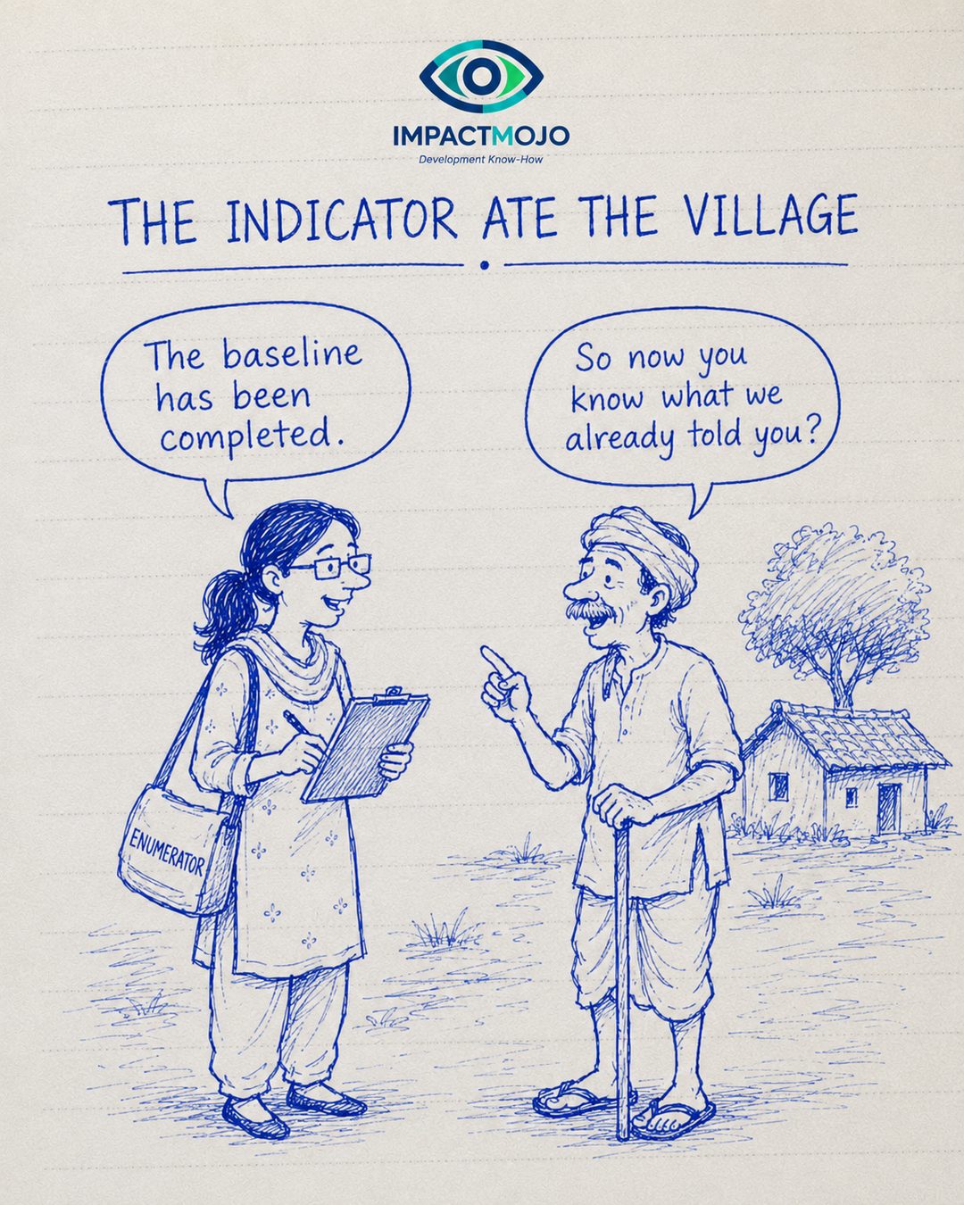
The claim“The baseline has been completed.”The reply“So now you know what we already told you?”
The baseline as extraction
A baseline often tells the community what it already knows, in a form the community cannot use, and carries the knowledge upstream. Robert Chambers spent a career on this asymmetry — Whose Reality Counts? — arguing that participatory methods exist precisely because rural people already hold detailed, accurate knowledge of their own conditions; the system simply refuses to trust it until an outsider has re-collected and formatted it.2
If the finished baseline contains no surprise for the people it surveyed, the exercise measured them; it did not learn from them. The elder’s question is really about ownership of knowledge: who is the data for, and does any of it ever come back?
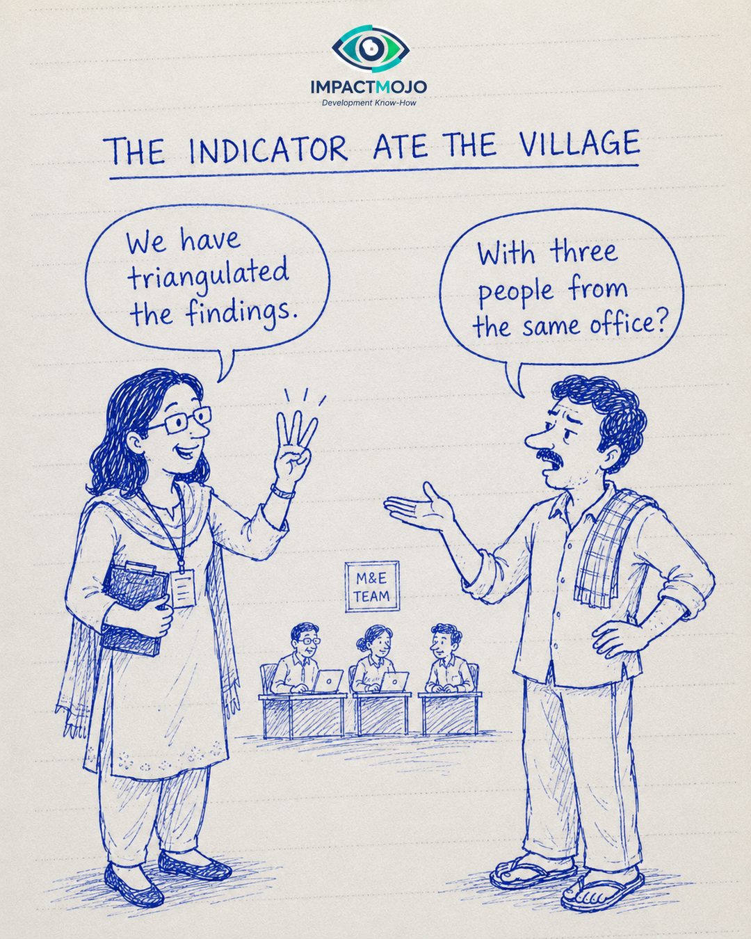
The claim“We have triangulated the findings.”The reply“With three people from the same office?”
Triangulation needs a second angle
Triangulation, as Norman Denzin defined it, means checking a finding against genuinely different vantage points — multiple data sources, methods, investigators or theories — so the bias of any one is exposed by another.3 Three colleagues from the same unit, reading the same dataset with the same training, share the same blind spots; their agreement is consistency, not triangulation.
The angle that matters is the one the office doesn’t have: the household, the dropout, the person who never entered the sampling frame. A second opinion from inside the echo only confirms the echo.
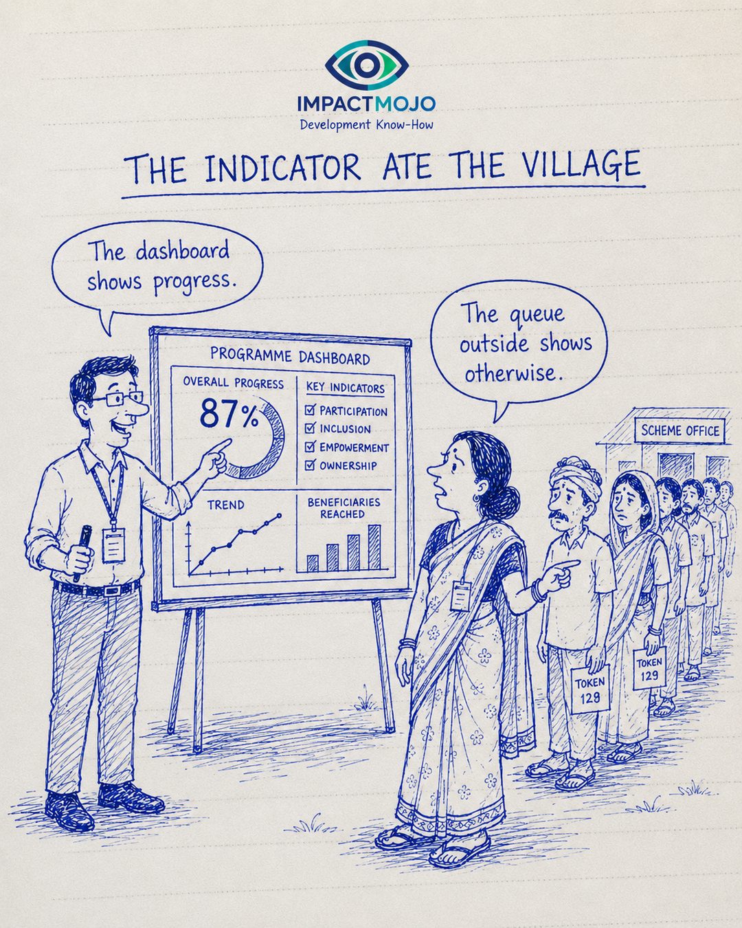
The claim“The dashboard shows progress.”The reply“The queue outside shows otherwise.”
The map is green; the territory is queuing
This is Goodhart’s Law rendered in tiles: once a measure becomes the target, it stops being a good measure, because effort flows to the number rather than the thing it stood for.4 Donald Campbell put the social-policy version more bluntly — the more any quantitative indicator is used for decision-making, the more it will be gamed, and the more it will distort the process it was meant to monitor.5
A dashboard at 87% and a queue out the door are both true at once. The dashboard measures what was reported; the queue measures what was delivered. When they diverge, the village is living in the territory, not the map.
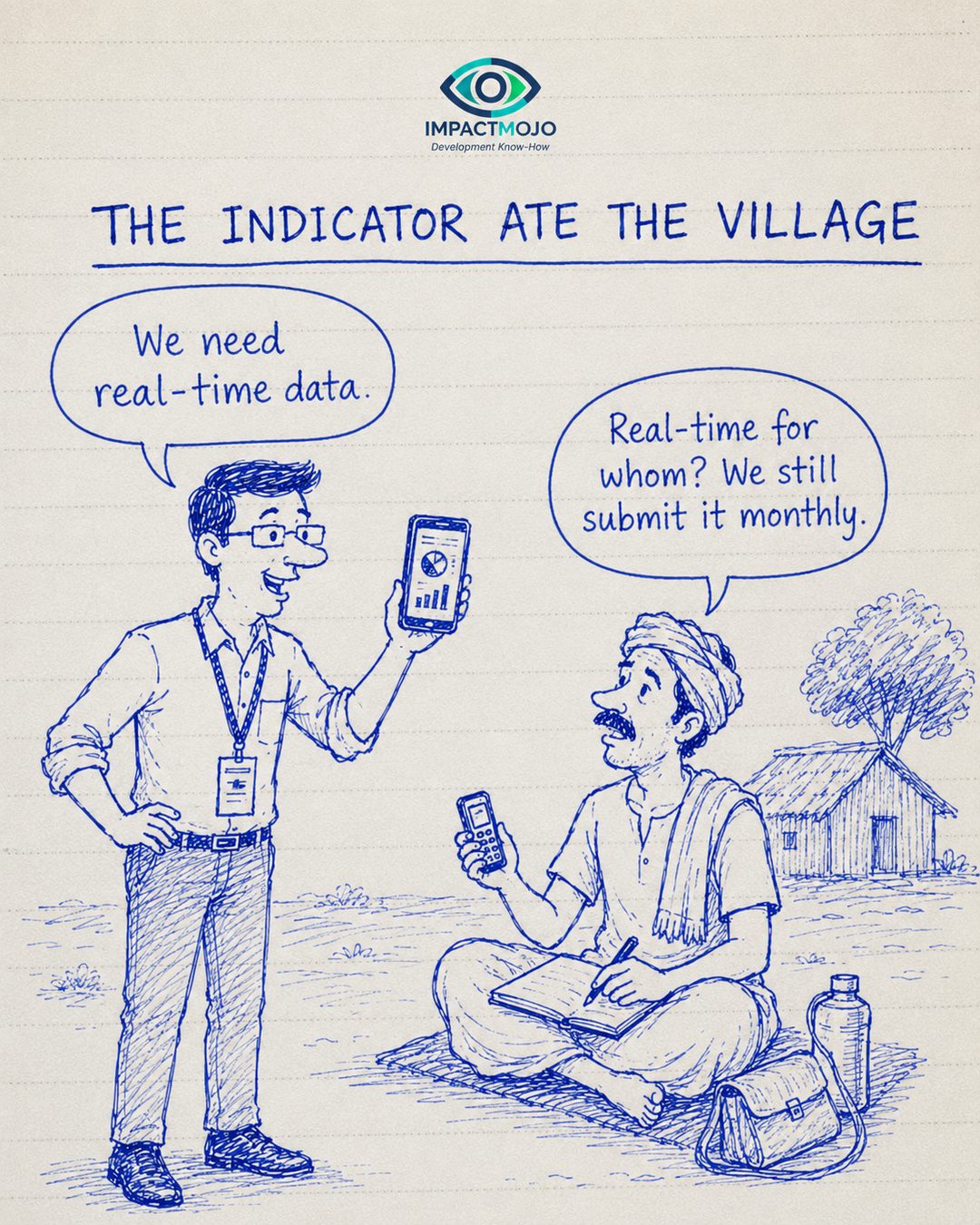
The claim“We need real-time data.”The reply“Real-time for whom? We still submit it monthly.”
Real-time, for whom?
“Real-time data” almost always means real-time for the people upstream. Rosalind Eyben and colleagues, writing on the politics of evidence and results, traced how the results agenda channels information upward to funders and headquarters on their cadence, while the field still files on paper and rarely sees the data return as anything it can act on.6
A demand for faster data that doesn’t change what flows back to the people generating it is a demand for faster extraction. Real-time for the dashboard; still monthly, still one-directional, for the village.
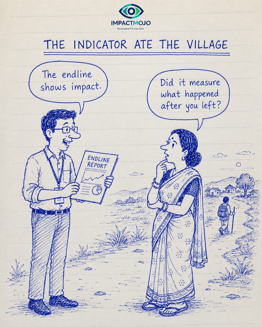
The claim“The endline shows impact.”The reply“Did it measure what happened after you left?”
Impact that outlives the project
An endline measured the week before the team departs captures outputs at their peak, not durability. Sustainability — whether benefits continue after support ends — is a distinct OECD-DAC evaluation criterion precisely because programmes routinely look successful at endline and unravel within a year of exit.7
“The endline shows impact” and “nobody measured what happened after you left” describe a project evaluated at its best moment and never at its real test. The indicator closed on a high note; the village kept living after the report was filed.
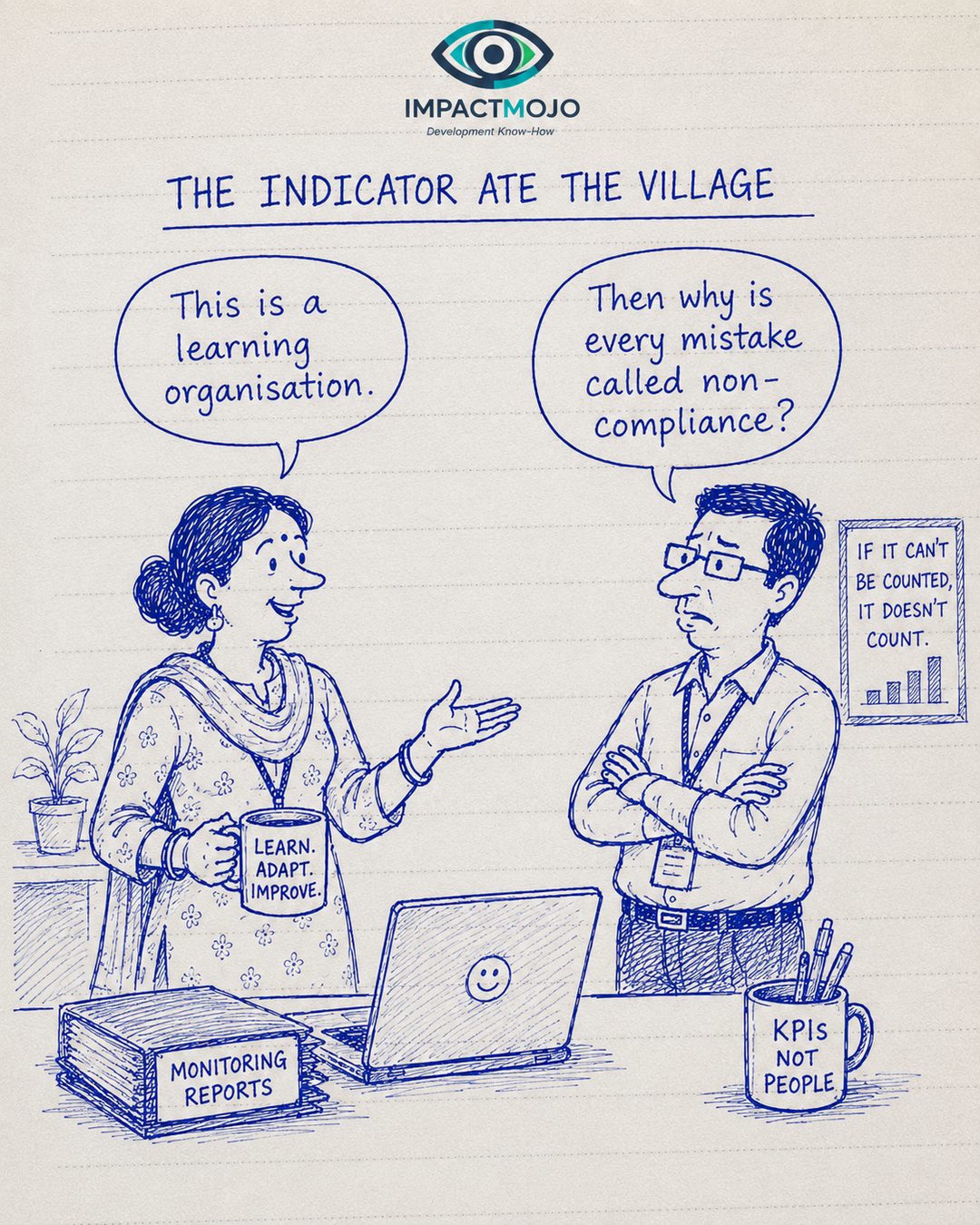
The claim“This is a learning organisation.”The reply“Then why is every mistake called non-compliance?”
Audit dressed as learning
Michael Power named the condition: the Audit Society, in which the rituals of verification expand until checking becomes the work and every deviation is logged as a fault.8 An organisation that calls itself “learning” but files every mistake as non-compliance has built an audit culture and put a learning label on it.
Genuine adaptive practice — the premise of the Doing Development Differently movement — requires the freedom to be wrong on purpose: to pilot, fail small, and adjust.9 You cannot learn in a system whose only category for an unexpected result is a violation.
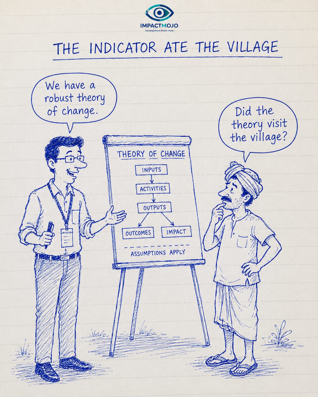
The claim“We have a robust theory of change.”The reply“Did the theory visit the village?”
A theory that never did fieldwork
A logframe whose boxes flow neatly from inputs to impact under “assumptions apply” can be perfectly internally consistent and still describe nowhere in particular. Matt Andrews, Lant Pritchett and Michael Woolcock call the result isomorphic mimicry — organisations adopting the forms of a best-practice model to look legitimate while the functions never arrive, producing what they term “capability traps.”10
The diagram is not the territory. A theory of change that has never been pressure-tested against the village it claims to transform is an assumption with arrows — elegant on the flipchart, untested on the path outside it.
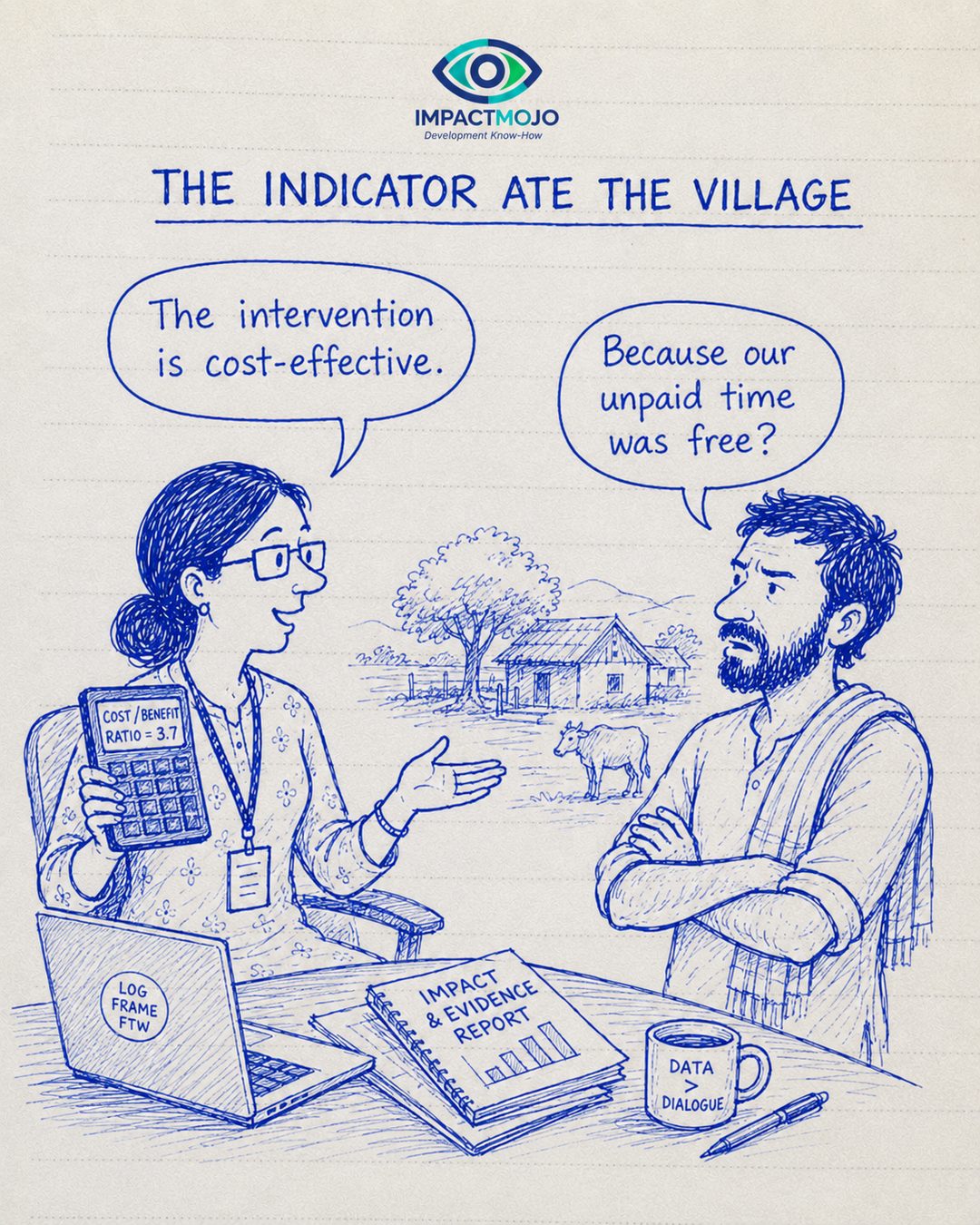
The claim“The intervention is cost-effective.”The reply“Because our unpaid time was free?”
Free, because someone wasn’t paid
A cost-benefit ratio looks excellent when the largest input — community time, overwhelmingly women’s — is priced at zero. Marilyn Waring’s If Women Counted showed how national accounting renders unpaid work invisible by convention, not because it lacks value.11 The ILO estimates that unpaid care work, if counted at even a modest wage, would equal a large share of global GDP.12
“Cost-effective” that quietly rests on unpaid attendance, mobilisation and care is not efficiency — it is a subsidy flowing from the people the programme is meant to serve. The ratio is 3:1 only because one side of the ledger was left blank.
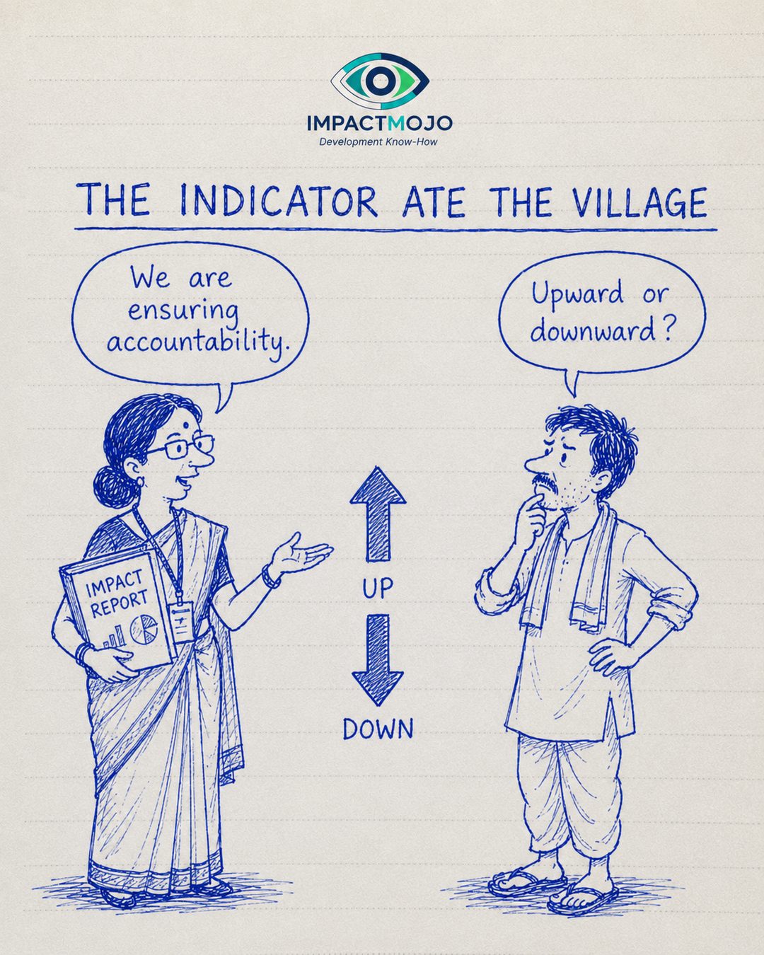
The claim“We are ensuring accountability.”The reply“Upward or downward?”
Which way does accountability point?
The 2004 World Development Report, Making Services Work for Poor People, mapped the routes by which services are held to account: a “long route” through politicians and providers, and a “short route” directly from citizens to the people who serve them.13 Most programme accountability runs in neither direction — it runs upward, to the funder, through the report.
Alnoor Ebrahim showed that NGO accountability mechanisms overwhelmingly serve upward and external demands, while downward accountability — to the communities affected — stays weak and largely voluntary.14 “Ensuring accountability” answers nothing until you say in which direction the answer flows.
None of these tools are the enemy. Baselines, dashboards, theories of change and endlines are how a sector accountable to distant funders tries to see. The joke is what they leave out of frame — the exhaustion behind the rising line, the queue behind the green tile, the unpaid hours behind the ratio, the year after exit. The indicator only ate the village because we let it eat alone. Put the missing rows — who is tiring, who is waiting, who wasn’t paid, what happened after we left — in the same system as the targets, and measurement goes back to serving the work instead of replacing it.
Notes & Sources
Andrew S. Natsios (2010). The Clash of the Counter-bureaucracy and Development, Center for Global Development essay. — cgdev.org
Robert Chambers (1997). Whose Reality Counts? Putting the First Last, Intermediate Technology Publications (on participatory appraisal and local knowledge). — ids.ac.uk
Norman K. Denzin (1978). The Research Act: A Theoretical Introduction to Sociological Methods — the four types of triangulation (data, investigator, theory, methodological). — overview
On Goodhart’s Law (“when a measure becomes a target, it ceases to be a good measure”) in service systems. — pmc.ncbi.nlm.nih.gov
Donald T. Campbell (1979). “Assessing the impact of planned social change,” Evaluation and Program Planning 2(1): 67–90 — Campbell’s Law on the corruption of social indicators. — full text (PDF)
Rosalind Eyben, Irene Guijt, Chris Roche & Cathy Shutt (eds.) (2015). The Politics of Evidence and Results in International Development (the “Big Push Forward”). — practicalactionpublishing.com
Michael Power (1997). The Audit Society: Rituals of Verification, Oxford University Press. — global.oup.com
“Doing Development Differently” Manifesto (2014), Harvard Center for International Development / ODI. — buildingstatecapability.com
Matt Andrews, Lant Pritchett & Michael Woolcock (2017). Building State Capability: Evidence, Analysis, Action, Oxford University Press (isomorphic mimicry; capability traps) — open access. — bsc.cid.harvard.edu
Marilyn Waring (1988). If Women Counted: A New Feminist Economics — on the invisibility of unpaid work in national accounts. — overview
International Labour Organization (2018). Care Work and Care Jobs for the Future of Decent Work — valuation of unpaid care work. — ilo.org
World Bank (2003). World Development Report 2004: Making Services Work for Poor People — the “long route” and “short route” of accountability. — openknowledge.worldbank.org
Alnoor Ebrahim (2003). “Accountability in Practice: Mechanisms for NGOs,” World Development 31(5): 813–829 (upward vs downward accountability). — sciencedirect.com